


Responsive Design Makes Websites Mobile
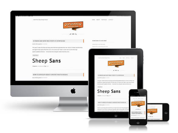

Laptops, tablets, netbooks, notebooks, subnotebooks, handheld PCs, PDAs, smartphones…computing has gone mobile, raising the question of whether or not the”desktop” version of websites — with the ability to zoom and pan the touch-screen — can go along for the ride.
Users are visiting websites from an increasing array of devices and browsers, so designers and developers are working with different screen resolutions in order to guarantee that a website looks good from all angles.
Can websites be optimized for the kinds of actions that mobile users might typically perform?
Yes, says author Ethan Marcotte in his book “Responsive Web Design,” published by A Book Apart.
And the team at DigitalEYE Media, a leading Orange County website design firm, agrees.
The concept of responsive design refers to the process of designing and developing websites that react to a user’s actions and detect the device or medium on which the site is currently being watched in order to provide the best experience possible to the user in terms of navigability and readability.
The theory behind responsive design involves the utilization of several grid and layout systems, image optimization and CSS media queries. So, no matter how many devices are released in the future, a responsively designed website will always be able to provide a proper response to any viewer’s particular device or browser.
Responsive web design is not simply about reducing font sizes and shrinking a picture to make it fit a new format. This concept requires a thoughtful process whereby designers and developers work together to determine how to redistribute a website’s elements according to resolution, how to decide which elements may be eliminated and how to maintain the concept while simplifying the structure.
The challenges are obvious. For example, Web pages that include data tables present special difficulties for the responsive web designer. Data tables are very wide by default and when you zoom out to see the whole table it becomes too small to read. When you try to zoom in to make it readable, you are supposed to scroll both horizontally and vertically to look through it. Workarounds include reformatting the data table as a pie or mini-graph, which fixes even in narrow screens.
There are three key elements to Responsive Web Design:
1) Flexible Grid
Most websites have been designed using a fixed width style and centered content, an effective method since most computers worked under the same screen resolution. Now that screen resolutions have changed so much, a fixed width design is not the best solution for designs, which leads to the concept of “liquid layouts.”
Liquid layouts are based on percentages of the current browser window’s size. They flex with the size of the window, even if viewers change their browser size as they view the site. Liquid width layouts allow a very efficient use of the space provided by any given Web browser window or screen resolution.
Liquid layouts are often preferred by designers who have a lot of information to get across in as little space as possible, as they remain consistent in size and relative page weights regardless of who is viewing the page.
But the concept of flexible grid goes beyond liquid layouts. In flexible grids, the elements are essentially resized and rearranged. A flexible grid makes a complete overhaul in terms of proportions, ensuring that all the elements in a layout are resized in relation to one another when stretched or contracted.
2) Flexible Images
The second component in responsive design is flexible images. In regular liquid pages, images are simply resized through width and height attributes, which helps to keep the information organized but does not optimize the loading times. Another method for fitting images into different screen resolutions is using CSS’s overflow property for cropping them dynamically as the containers are modified to fit new environments.
3) Media Queries
The third element of the responsive design triad is CSS media queries, an approach more important to developers and programmers than designers. Media queries allow you to collect data about the visitor and utilize it to apply the CSS styles that can provide the best user experience for the visitor.
Responsive Design & SEO
Because of its fast-loading features, responsive design may also be great for search engine optimization. The Digital EYE team always tries to factor in page performance as part of our corporate SEO services. We believe this to be a long-term strategy that the search engines will continue to use as a ranking signal.
Contact DigitalEYE Media for information on how to Create and Manage your Social Media Marketing Campaigns: P: (714) 556-0576; sales@digitaleyemedia.com.