


5 Reasons Why You Should Consider Responsive Design for Your Website

Responsive web design is all the rage among web designers these days, and with good reason. Web users are no longer limited to choosing between a bulky desktop or even the more mobile laptop. With the advent of smartphones, tablets, and wearable devices, consumers can access the Web anytime they choose from a mobile device that can be carried in a pocket, purse, or even on the wrist.
Your Design Options: Responsive Web Design or a Mobile-specific Website
A mobile-specific website is just that – designed specifically for viewing on a mobile device. Image and text content is carefully designed to be easily accessed and read by the mobile user. The website uses device detection to route mobile device users to a dedicated mobile version. The problem is that only a portion of the full website’s features are included. While many mobile users are only interested in basic information such as store location and business hours that can be easily incorporated into a mobile version, some users may want more.
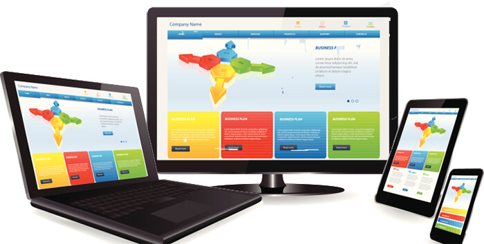
On the other hand, responsive web design (RWD) houses all of the design elements and content under one roof, which allows users full access to all website content regardless of the type of device they use.
A Responsive Web Design Puts User Experience First
Providing a good user experience is the single most important aspect of good web design. According to Google’s research team, 61 percent of mobile users will exit your site if they find it too frustrating to navigate or can’t find what they are looking for. On the other hand, 67 percent of users who have a positive experience with your site will likely make a purchase. An RWD site provides your visitors with a positive experience no matter what device type or configuration they use.
Responsive Web Design Simplifies Your SEO Efforts
Having a mobile-specific site as well as a desktop version effectively doubles your SEO work. This means twice the number of articles, twice the number of social profiles, and twice the number of quality backlinks. An RWD site on the other hand, allows you to SEO only once for all versions of your website. What’s more, an RWD site is preferred by Google because of the positive user experience it provides. As an added bonus, mobile-friendly sites are already receiving preferential treatment in the search results.
Responsive Web Design Displays Well Regardless of Screen Size
There are presently no less than 20,000 different types of Android devices, to say nothing of the number of other smartphones, tablets, and other devices – all with different screen sizes and resolutions. The only practical way to accommodate all of these options is with an RWD site that intelligently configures itself to look good on every type of device.
Responsive Web Design Allows for Multi-device Tasking
Many users have a choice of device which varies according to their location, and what they want to accomplish. For example, a user might begin a search for a store on their home desktop, permitting them to read reviews at their leisure. Once on the road, they might use their smartphone to access directions to the store’s location. The key takeaway here is that users frequently use a variety of devices to access the Web, and an RWD site is the best way to ensure that your business is always accessible no matter what device the user happens to be using at the moment.
Responsive Web Design Adapts to the Future
Who can tell what new technologies tomorrow may bring? Whatever type of device users will be using to browse the Web in the future, you’re covered with an RWD site. Because your site template is based on screen size rather than device configuration, your website will continue to display beautifully regardless of whether the user is viewing it from a full screen TV or a wristwatch.